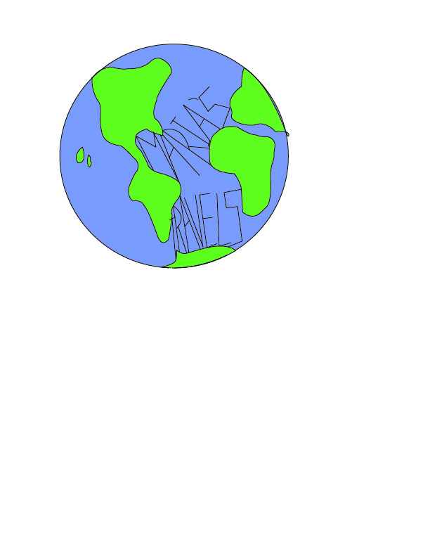
When making my logo I wanted to incorporate the globe because my blog is all about traveling and the experiences I’ve had while abroad. I also incorporated my blog name. I did not use any sites for research, just looked at a graphic of a globe to figure out the proportions. I put my name in the center of the globe because I was at the center of everything, more particularly traveling, during my semester abroad. When I go to edit and update my design, there are many things I would change. I like the overall concept, but I think I would change the colors of the globe to different ones that fit my personality more instead like pinks and blues so that it is more personalized. I also think I would change how my name is written in the globe. I don’t think the way the title is presented is ideal, so I would look into different ways to adjust that. I think that there are many things I could do to improve how my logo translate to different viewers. I think my logo is balanced in a way that it is easy to read, but it could be a lot better. I would also like to crop the art board so that only the globe is showing, not the white around it. Overall, I didn’t have a hard time formulating the basic idea of my logo but actually creating it proved to be a bit of a challenge. I enjoyed using illustrator again to make a more personalized design but the program is very confusing and very hard to use at different aspects. I will dive into more videos on how to improve the text used in my logo so it can potentially be scaled and used in different aspects on my website.
