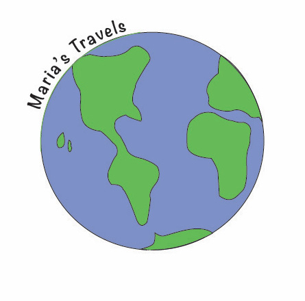
When making my logo I wanted to incorporate the globe because my blog is all about traveling and the experiences I’ve had while abroad. I also incorporated my blog name. I did not use any sites for research, just looked at a graphic of a globe to figure out the proportions. Originally, I put my name in the center of the globe because I was at the center of everything, more particularly traveling, during my semester abroad. The main change I made was changing the location of my text to around the globe. I move the typography to the place it is for the representation that I went around the globe. I got this idea from the peer reviews that were given to me on the discussion board. I went back and forth with changing the colors of the globe like I had mentioned in the previous blog post. I tried to change them to colors that fit my personality more but decided against it so that the idea of my logo was not lost. I like my logo and think it could be scaled to be smaller or possibility be bigger. I think It is direct and to the point so readers will not be confused when seeing my logo for the first time. I like the way my logo turned out, and I think that it is easily read. Overall, I didn’t have a hard time formulating the basic idea of my logo but actually creating it proved to be a bit of a challenge. I enjoyed using illustrator again to make a more personalized design, but the program is very confusing and very hard to use at different aspects.
